
Creating a landing page that effectively turns visitors into customers is both an art and a science. It is where you connect your marketing efforts to direct prospects towards taking a desired action such as registration for newsletters, eBooks downloads or product purchases. A well-designed landing page, tailored for paid ads or SEO enhancement, can dramatically increase your conversion rates, while a poorly crafted one can drive people away. To help you create effective landing pages, here are some key dos and don’ts.
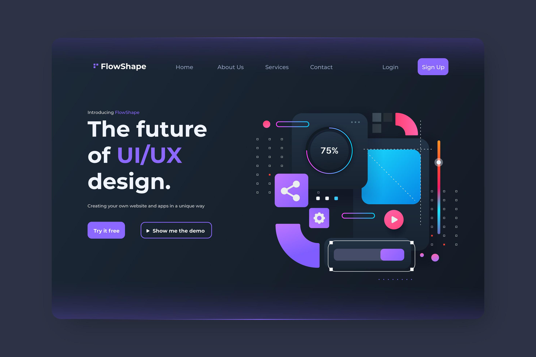
Do: Craft a Clear and Compelling Headline
The headline is the first thing people see when they land on your page, so it needs to grab their attention right away. It should clearly convey the value of your offer in a way that makes visitors want to keep reading. Think of it as your one chance to make a great first impression. A strong headline sets the stage for the rest of the page and encourages visitors to stick around.
For example, instead of a vague headline like “Learn About Our Products”, try something more specific and benefits-focused, like “Transform Your Home with Our Eco-Friendly Cleaning Solutions”. This not only catches the eye but also immediately tells visitors what they can expect.

Don’t: Overload with Information
While it’s important to explain the benefits of your offer, too much information can overwhelm visitors. A landing page should be concise and to the point, with every word serving a purpose. Avoid the temptation to include every detail, this can lead to confusion and make it harder for visitors to make a decision.
Instead, keep your copy short and focused. Highlight the key benefits and features with bullet points to make it easy for visitors to scan the page and quickly understand what you’re offering.
Do: Use a Strong Call-to-Action (CTA)
The call-to-action (CTA) is the most important part of your landing page. It’s what you want visitors to do next, whether that’s signing up, downloading something, or making a purchase. Your CTA should be clear, easy to find, and encourage action.
Use bright, contrasting colors for your CTA button to make it stand out, and choose action-oriented language like “Get Started Now”, “Download Your Free Guide”, or “Claim Your Discount Today”. Also, think about where you place your CTA on the page, while it’s common to have one at the bottom, adding another near the top can capture those who are ready to take action right away.
Don’t: Use Vague or Passive Language
The words you use on your landing page matter a lot. Avoid vague or passive language that leaves visitors unsure of what to do next. Your copy should be clear, direct, and encourage immediate action.
For instance, instead of saying “You might want to consider signing up”, go for something stronger like “Sign up now to start benefiting from our exclusive offers.” This leaves no room for hesitation and encourages visitors to act right away.
Do: Add Visual Elements
People are visual by nature, so incorporating high-quality images or videos on your landing page can make it more appealing. Visual elements help break up text and reinforce your message, making your offer more relatable.
If you’re promoting a product, include images or videos showing it in use. This helps visitors understand what you’re offering and builds trust by giving them something tangible to see. Just make sure your visuals are relevant and don’t distract from the main message, every image or video should support your goal.

Don’t: Neglect Mobile Optimization
More and more people are using mobile devices to browse the internet, so your landing page needs to be mobile-friendly. If your page looks great on a desktop but is hard to use on a smartphone, you could lose potential customers.
Make sure your landing page is responsive, meaning it adjusts to fit different screen sizes. Test it on various devices to ensure that everything works smoothly and that your CTA is easy to click, no matter the device.
Do: Include Trust Signals
Trust is crucial when you’re asking visitors to take action, especially if it involves sharing personal information or making a purchase. Adding trust signals like testimonials, reviews, and security badges can make your page more credible.
For example, including a section with customer testimonials can help ease any doubts new visitors might have. Security badges and certification logos can also reassure visitors that their information is safe and that they’re dealing with a trustworthy business.
Don’t: Forget to Test and Optimize
Even the best landing pages can be improved, so it’s important to keep testing and optimizing. What works for one audience might not work for another, and small tweaks can make a big difference in conversion rates.
Use A/B testing to compare different headlines, CTAs, or images. Look at the results to see what works best, and adjust your page accordingly. Regularly reviewing and refining your landing pages ensures they stay effective and aligned with your goals.
Build Landing Pages That Convert
By following these dos and don’ts, you can create effective landing pages that not only attract visitors but also convert them into customers. The key to a successful landing page is clarity, simplicity, and a focus on user experience. Every element, from the headline to the CTA, should work together to guide visitors toward taking the action you want.
At Seven52, we specialize in creating landing pages that drive results. Whether you’re launching a new product or looking to boost your lead generation, we can help you design a landing page that meets your goals and resonates with your audience. Contact us today to learn more about our services and how we can help your business grow.