In digital marketing, paid ads are an excellent way to drive traffic and generate leads. But getting users to click on your ad is only half the battle. The landing page they arrive at is what ultimately determines whether they take the next step, whether that’s making a purchase, signing up, or completing a form. If your landing pages for the paid ads are not up to the mark, you risk losing potential customers, and your ad spend goes to waste.
Here’s how you can optimize your landing pages to enhance your paid ad performance and ensure the best possible results.
1. Align Your Landing Pages with Ad Intent
The first thing to get right is making sure your landing page matches the promise of the ad. If someone clicks on your ad, it’s because they’re interested in something specific, whether it’s a discount, a product, or a special offer. If the landing page they reach doesn’t reflect what the ad promised, they’re likely to leave quickly, which means a higher bounce rate and wasted budget.
For example, if your ad highlights a “20% Off Sale on Running Shoes,” your landing page should immediately show that same offer. It should have clear details about the promotion, making it easy for users to take advantage of the deal. Consistency is key, not just with the offer but also with the overall look, tone, and message. If your ad is fun and energetic, the landing page should match that vibe. Keeping everything consistent builds trust and keeps users engaged, making them more likely to convert.
2. Keep Your Landing Pages Simple and Focused
One common mistake with landing pages is cramming too much information or offering multiple calls-to-action (CTAs). When someone arrives on your page, they should immediately know what action you want them to take. If the page is cluttered or confusing, users might feel overwhelmed and leave.
Stick to one clear CTA – whether it’s “Buy Now,” “Sign Up,” or “Download Free Guide.” The entire page should guide visitors toward that goal. Avoid distractions like excessive links, navigation menus, or irrelevant content. By keeping your landing page simple, you help users stay focused and improve their chances of converting.
A clean design, clear message, and a standout CTA button make it easier for visitors to navigate your page. This not only improves user experience but also helps reduce friction, leading to better conversion rates.

3. Use Attention-Grabbing Headlines and Visuals
The headline is the first thing users see when they land on your page, so it needs to be compelling. It should immediately capture their attention and clearly communicate the value of your offer. The headline should also tie back to the ad that brought users to the page, reinforcing the connection between the two.
For example, if your ad is promoting “Free Shipping on Orders Over $50,” make sure the headline on your landing page emphasizes that. Along with a strong headline, high-quality visuals like images or videos can also grab attention and help communicate your message.
Visuals can make your landing page more engaging and provide additional context. For instance, a product video or demonstration can show users exactly what they’re getting, making them more likely to take action. Just be sure that the visuals are relevant, high-quality, and don’t slow down your page.
4. Optimize for Mobile Devices
With so many people browsing the web on their phones, it’s critical that your landing page works well on mobile devices. A mobile-friendly landing page ensures that users can navigate your site easily, no matter what device they’re using.
To achieve this, make sure your landing page is responsive, it should automatically adjust to fit different screen sizes. Buttons and forms should be easy to use on a small screen, and text should be legible without zooming. Plus, fast load times are a must. If your page takes too long to load, mobile users will likely bounce.
Optimizing for mobile is crucial to getting the most out of your paid ads, as many people will be clicking through from their smartphones.

5. Include Trust Signals
Trust signals are crucial for building credibility, especially if it’s a user’s first interaction with your brand. Visitors need to feel confident that your business is legitimate before they take action, whether it’s making a purchase or sharing their information.
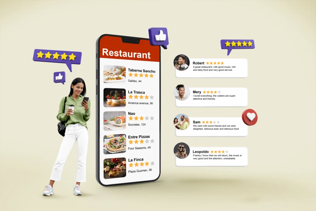
Adding elements like customer reviews, testimonials, and case studies can show visitors that others have had positive experiences with your brand. These forms of social proof help build trust. Security badges and payment seals can also help, especially if you’re asking for sensitive information like credit card details. A privacy policy can further reassure visitors that their data will be handled responsibly.
By incorporating these trust signals, you create a safer environment for users, making them more likely to complete the desired action.
The Role of Landing Pages in Paid Ads Success
Your landing page is just as important as the ad itself. By aligning the landing pages with the paid ads intent, keeping it focused, using strong headlines and visuals, optimizing for mobile, and including trust signals, you can significantly boost your conversion rates. Every click is an opportunity, and a well-optimized landing page ensures that you make the most of it.
At Seven52, we understand how important landing pages are in the success of paid ad campaigns. If you’re looking to improve your ad performance, contact us today, and we’ll help you create landing pages that drive results.


