
The challenge
Creating a stronger rhythm around wellbeing.
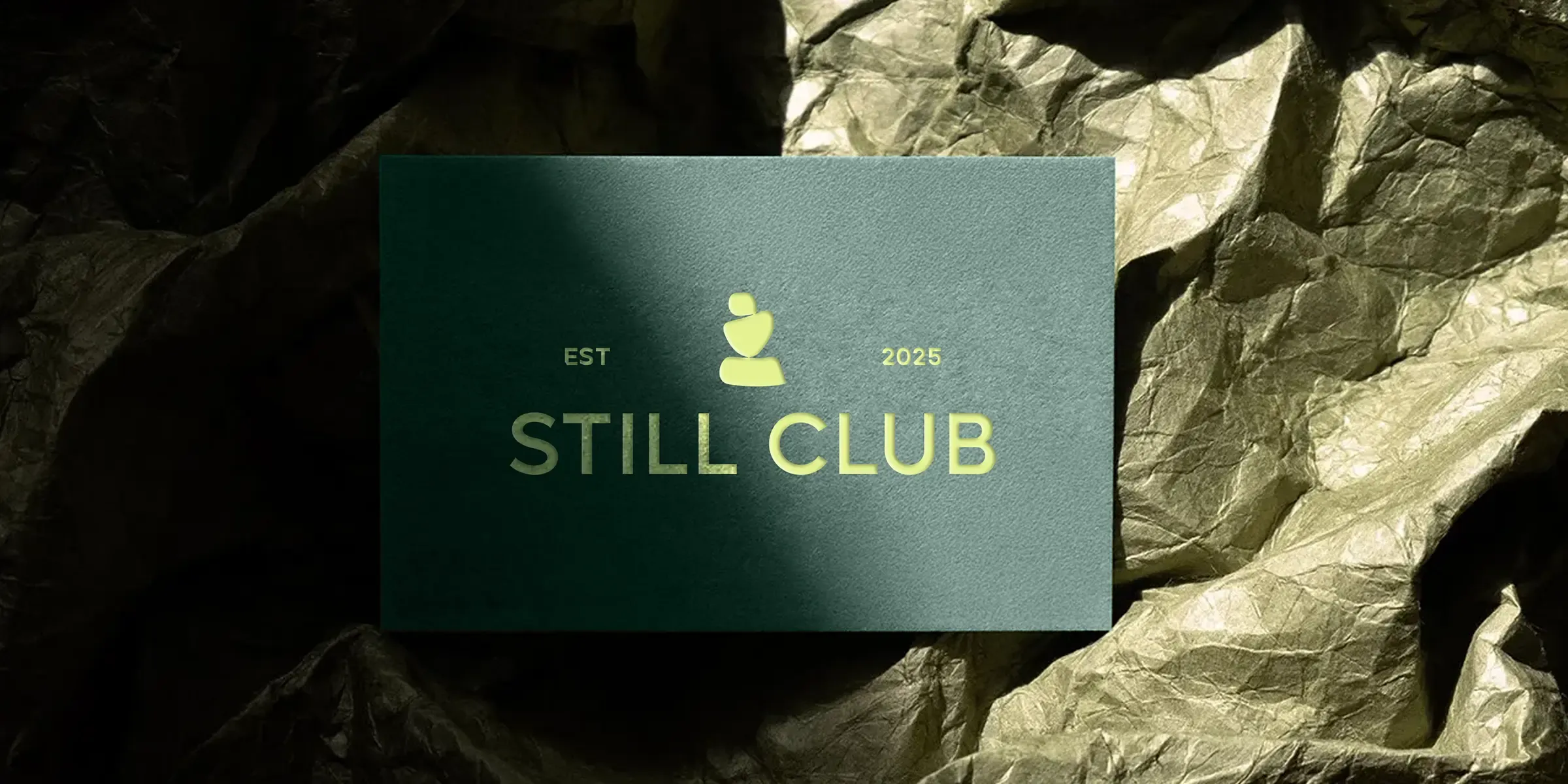
Still Club needed to stand apart in a crowded wellness market without becoming loud or losing the calm at the centre of its proposition. Its identity also had to connect several distinct practices within one coherent brand.
The system needed the flexibility to support intimate sessions, community experiences and international retreats while staying human, elevated and credible.
Our approach
A digital experience that keeps members engaged.
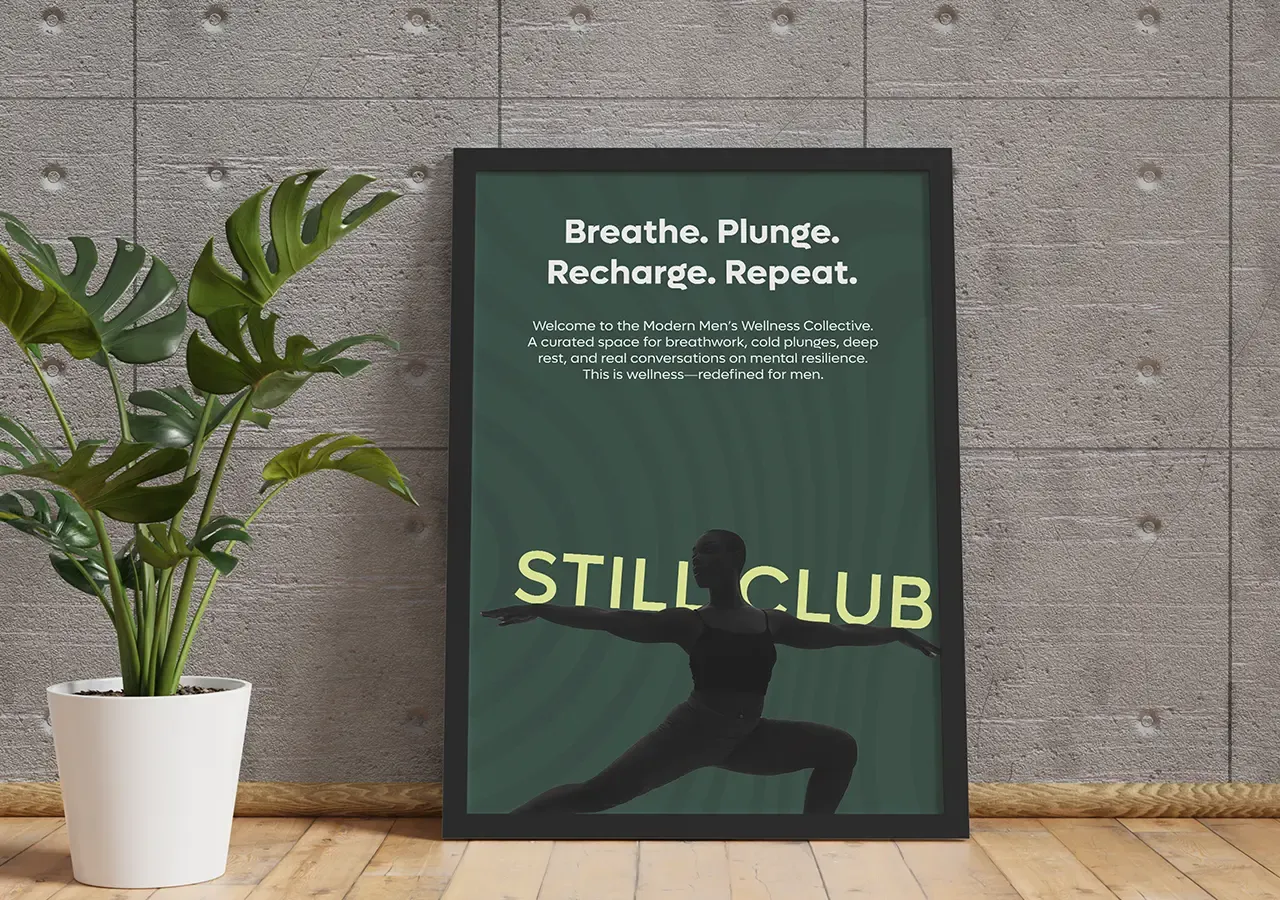
We began with the meaning of stillness as an active space for clearer thought, deeper recovery and genuine reconnection. That idea informed a direction combining softness with structure, fluidity with control and calm with grounded energy.
Every design decision was considered around how the brand should make people feel: present, supported, open and capable.
Brand Position
More than a moment of calm.
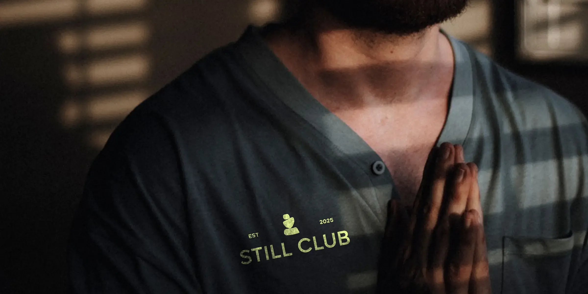
Still Club is positioned for people seeking a deeper and more intentional relationship with wellness. The brand creates experiences that help people return to everyday life with greater clarity, resilience and awareness.
This gives every practice a shared purpose while avoiding surface-level wellness language.
Visual Identity
Calm with grounded energy.
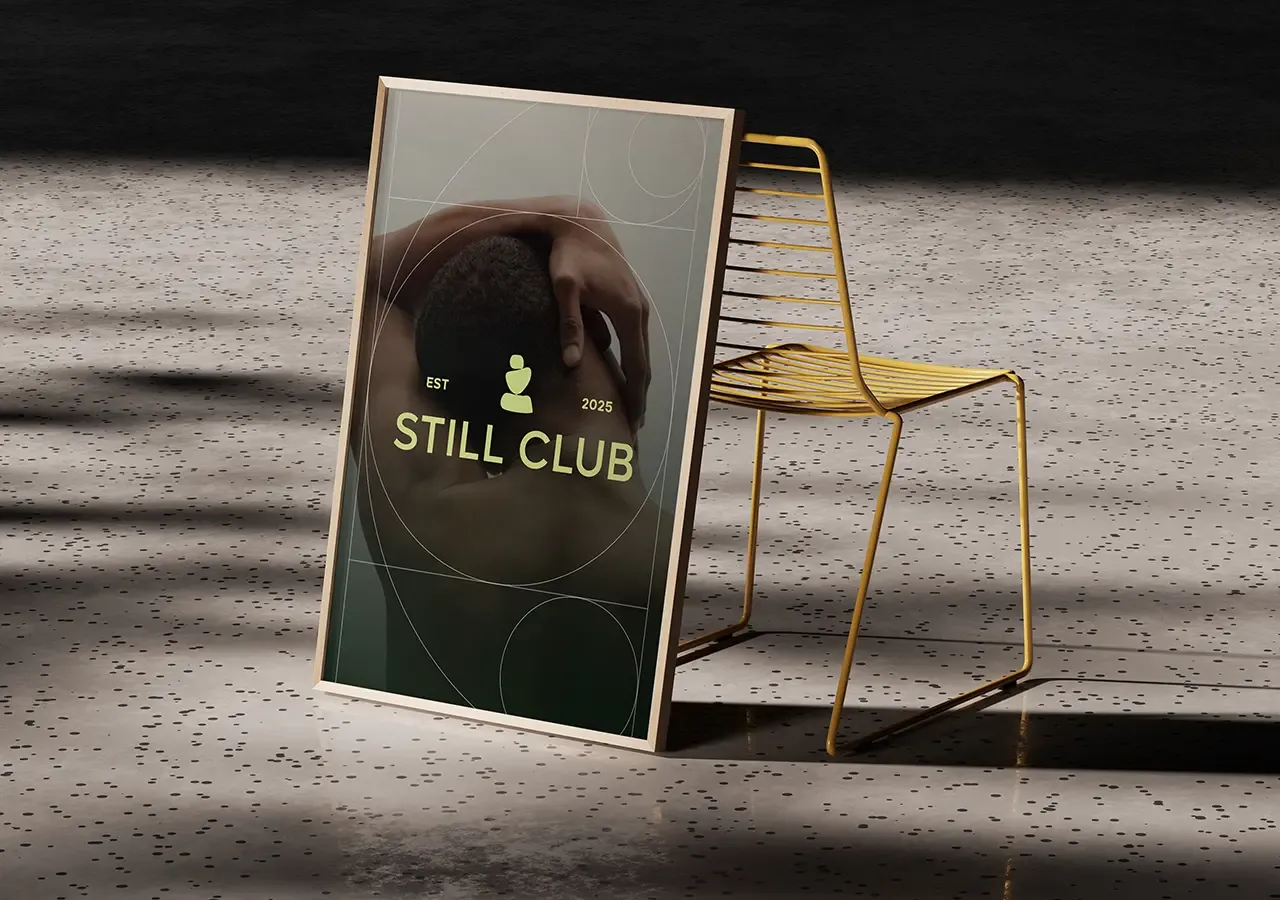
Restrained layouts create space and focus, while fluid forms introduce movement and reflect the rhythm of breath, recovery and release. Strong composition gives the system enough structure to feel intentional rather than delicate.
The result feels calm but never static.
Verbal Identity
A human voice for wellness.
The tone is calm, clear and emotionally intelligent. It speaks directly about slowing down, building resilience, resting properly, becoming present and connecting with others.
It creates an invitation rather than applying pressure.
Brand Experience
Designed for intimate and global experiences.
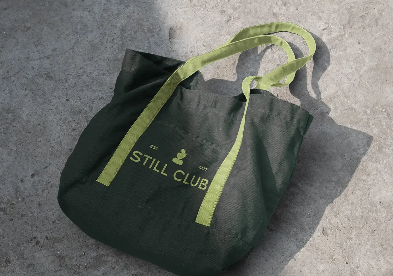
The system works across intimate breathwork sessions and larger international retreats without losing its character. It can extend into programming, schedules, booking experiences, journals, merchandise, environmental graphics and community content.
Each touchpoint can feel specific to the experience while remaining clearly part of Still Club.
The connected impact
More energy across every relationship.
The identity creates a distinctive position beyond surface-level wellness, capable of holding physical challenge, deep rest and genuine human connection within the same experience.
Its flexible visual and verbal system gives Still Club a consistent foundation as its sessions, communities and retreats evolve.
Overall results
Measured across the connected programme rather than isolated channel activity.