The challenge
Creating a hospitality brand that feels personal.
Casa Amá brings the warmth, energy and generosity of family cooking from Peru, Mexico and Brazil to the table. The identity needed to celebrate that diversity without reducing it to familiar visual clichés or disconnected regional references.
It had to feel vibrant without becoming chaotic, premium without losing warmth and contemporary without becoming overly polished. The brand also needed to communicate the family, generosity and gathering behind the food.
Our approach
A digital experience made for the table.
We built Casa Amá around the idea of the Latin family kitchen: a place shaped by flavour, conversation, shared dishes and recipes passed between generations.
Tactile textures, natural colours and bold typographic expression create a brand embedded within the restaurant, where every menu, wall, message and digital interaction contributes to one rich, immersive world.
Brand Position
Bold, earthy and unapologetically latin.
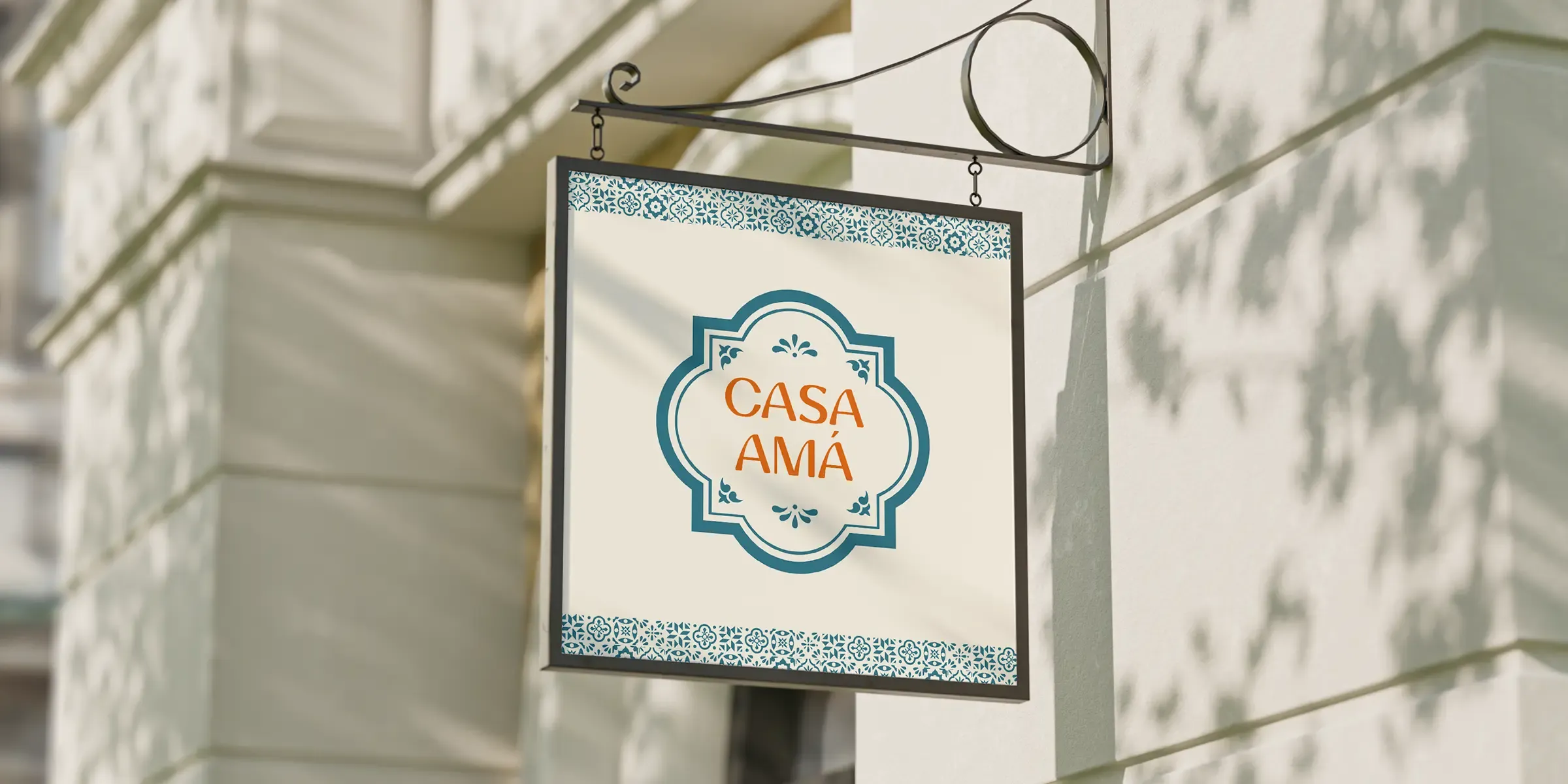
Boldness gives Casa Amá confidence and energy. Earthy details keep it grounded in ingredients, craft and cooking, while its Latin character brings warmth, rhythm and personality to the experience.
Together, these qualities create an expressive identity that remains authentic and avoids imitating tradition or relying on visual stereotype.
Creative World
Inspired by the family kitchen.
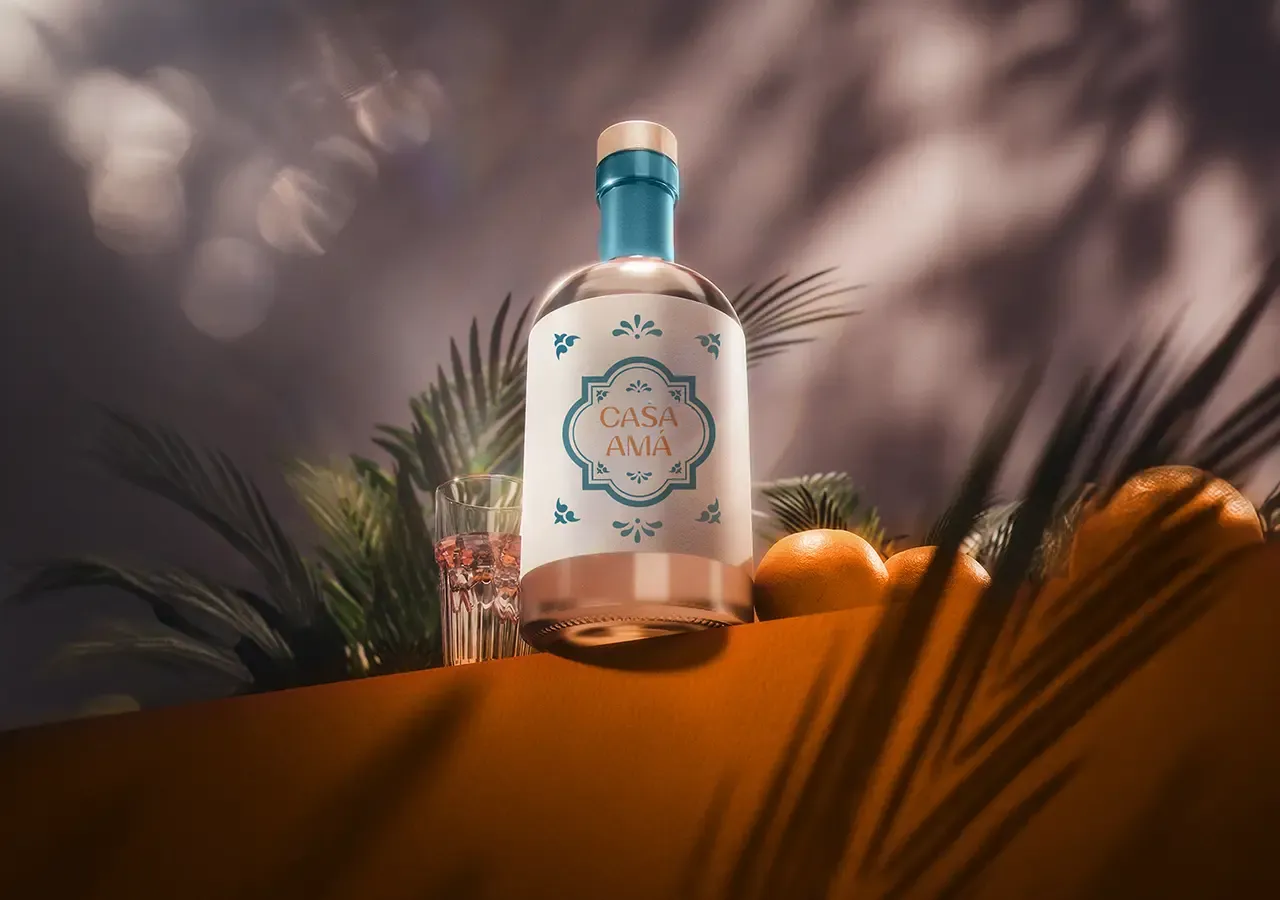
Layered surfaces, natural imperfections, handwritten notes, ingredients and collected objects informed a tactile identity that feels human, lived-in and shaped over time.
The direction connects Peru, Mexico and Brazil through shared qualities of colour, generosity, movement and communal dining while leaving room for individual dishes and stories.
Visual Identity
Texture, colour and confident typography.
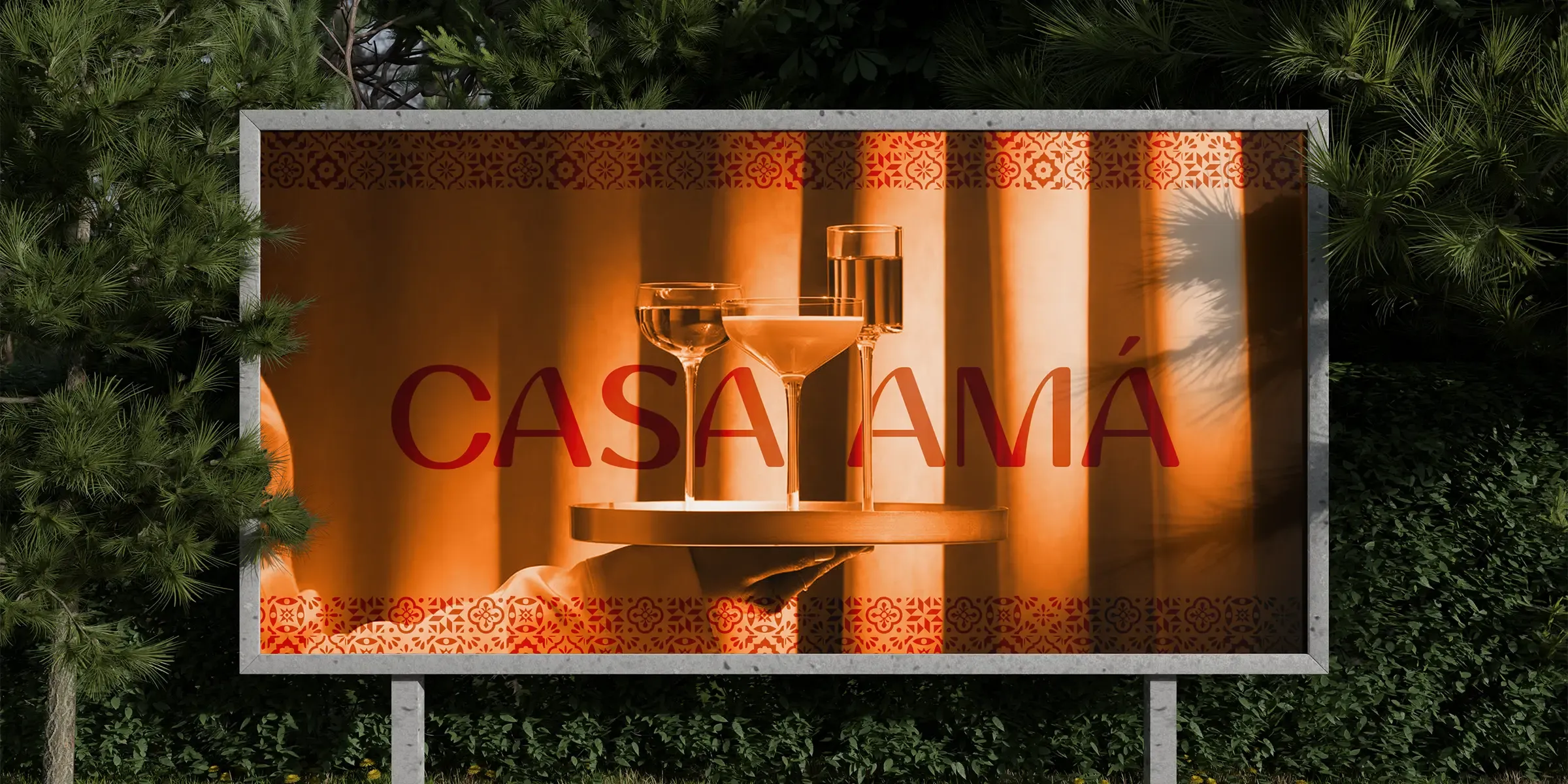
Earthy reds, sun-warmed neutrals and deeper organic tones create warmth and depth. Rich textures prevent the system from feeling clean or corporate, while controlled accents keep it energetic.
Strong display styles bring immediate personality across signage and menus, supported by typography that retains clarity and an informal warmth.
Brand Experience
Designed for the complete dining experience.
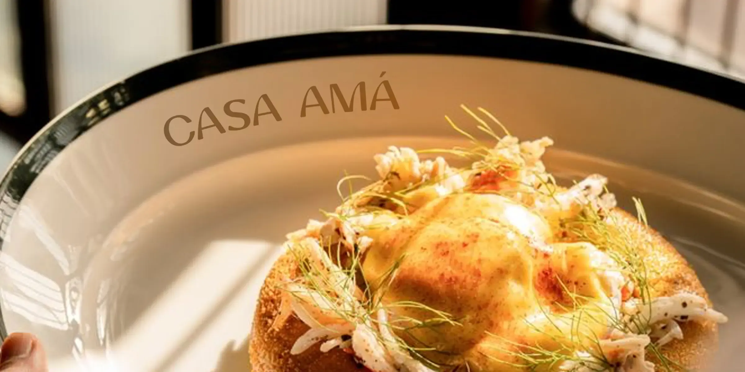
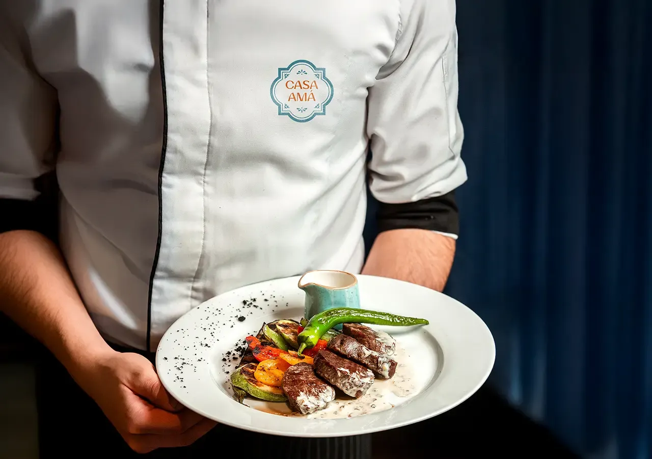
Menus, signage, interior graphics, table details, uniforms, packaging and social content all work as connected expressions of the same restaurant world.
The flexible system can introduce new dishes, events, collaborations and locations while retaining the soul that makes Casa Amá distinctive.
The connected impact
More connection before every visit.
Casa Amá now has an identity as expressive and soulful as the food it serves. Rich textures, earthy colours, confident typography and a generous tone of voice create a cohesive dining experience.
The brand lets guests encounter its warmth and character through food, atmosphere, design and every physical or digital touchpoint.
Overall results
Measured across the connected programme rather than isolated channel activity.