The challenge
Bringing the craft of omakase online.
Ōmakase brings together two distinct hospitality experiences: the discipline and intimacy of Japanese fine dining by day, and a more energetic social atmosphere shaped by food, music and movement as the evening develops.
The identity needed to communicate both sides without feeling inconsistent. A tradition-only approach would miss the after-dark energy, while a louder nightlife direction could undermine the precision and exclusivity of the dining experience.
Our approach
A digital experience shaped around anticipation.
We built the identity around contrast: stillness and movement, light and shadow, tradition and modernity, precision and spontaneity.
Minimalist, controlled foundations remain constant while ambient colour, fluid transitions and rhythmic graphics can increase as the venue moves into the evening, allowing the brand to transform without losing its character.
Brand Idea
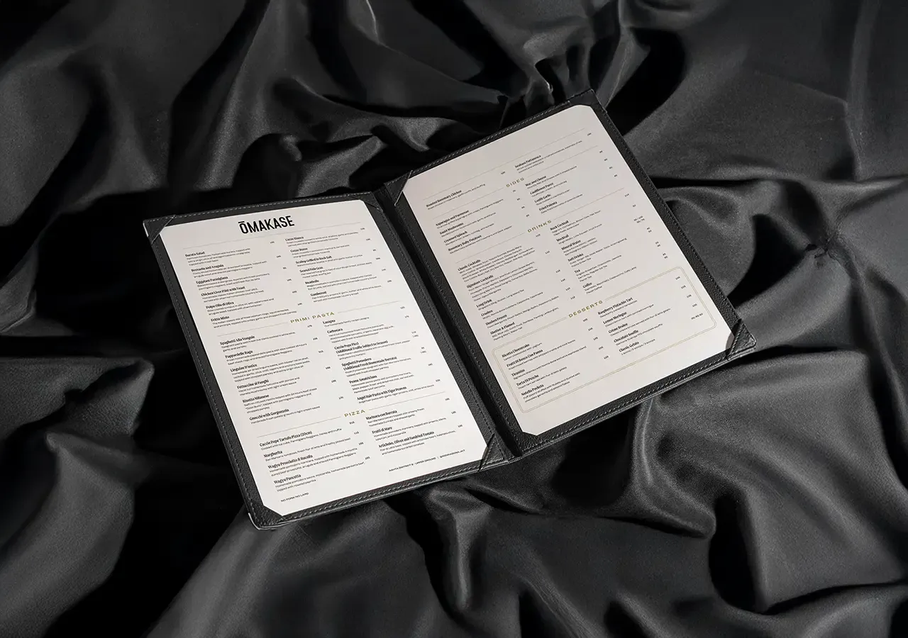
The art of contrast.
Contrast reflects the transformation inside the venue and the wider experience of Japanese fine dining, where delicate flavours meet intense ones and precise preparation creates moments of surprise.
Controlled layouts are balanced by expressive movement, monochrome foundations are interrupted by ambient accents, and visual silence creates greater impact as the brand becomes more energetic.
Day to Night
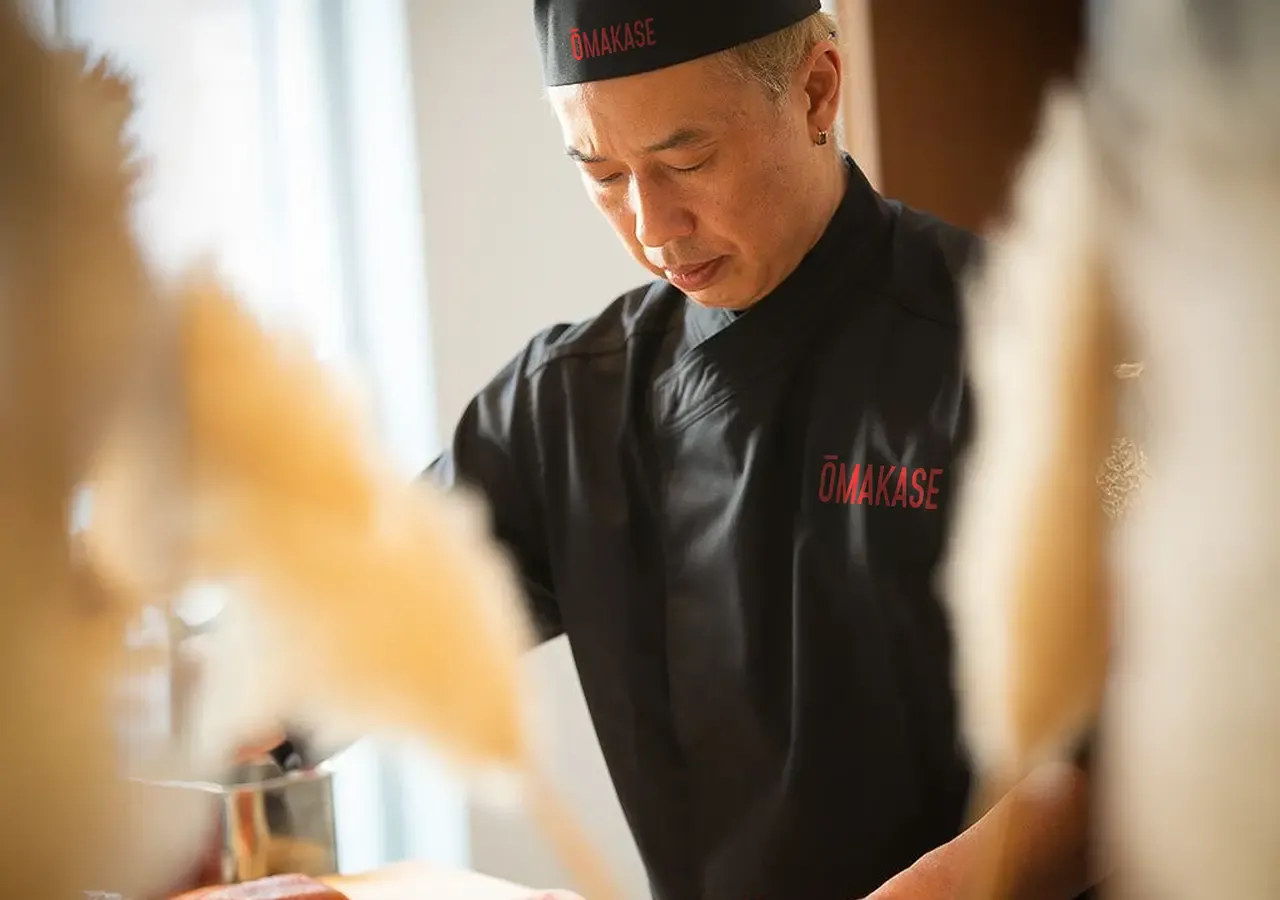
Calm ritual, energy after dark.
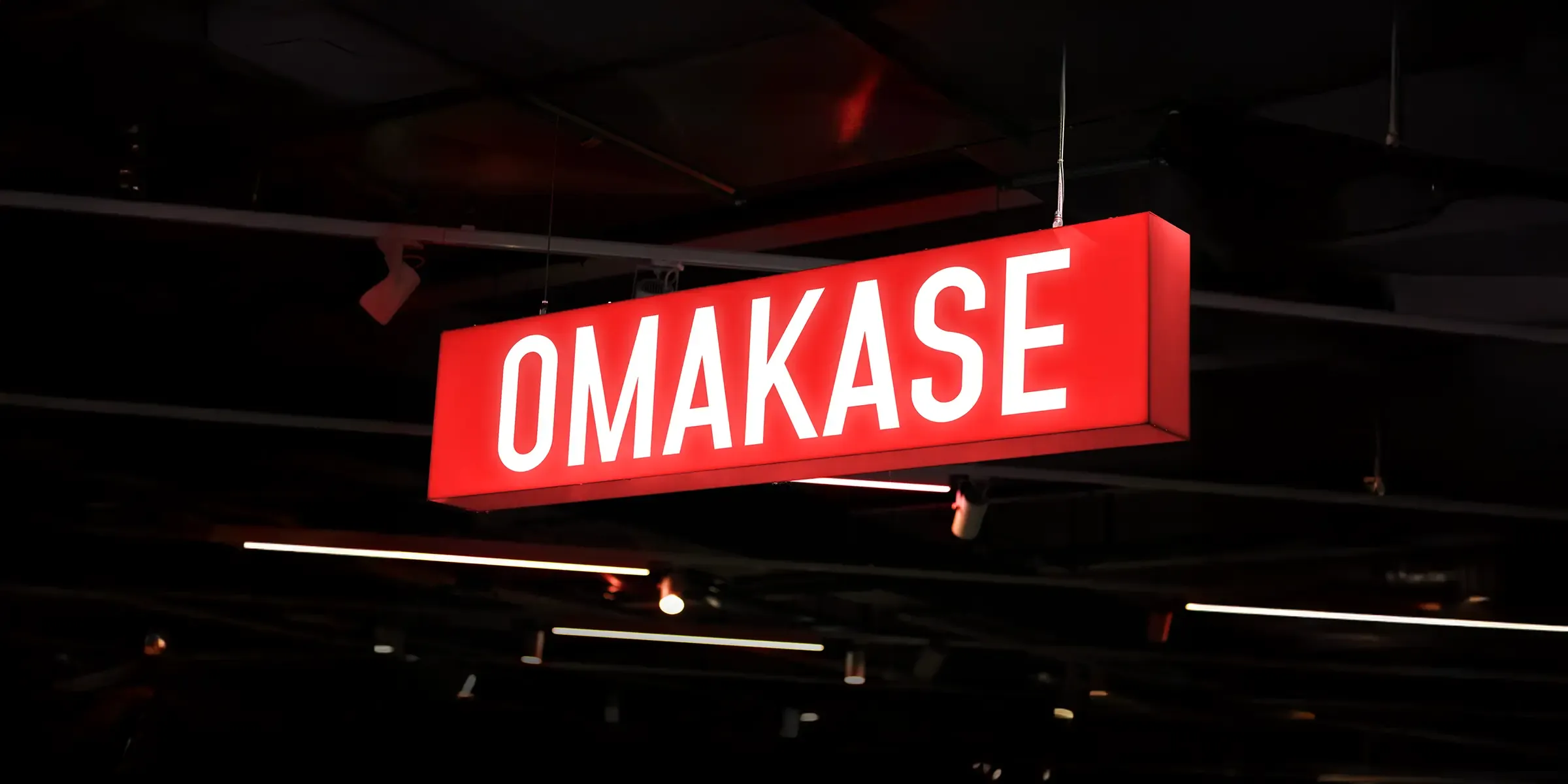
Generous spacing, minimalist compositions and a monochrome palette communicate the quiet precision of the daytime dining experience.
As the sun sets, ambient accents, rhythmic graphics and more dynamic composition introduce intensity while the core type, structure and visual principles remain recognisably Ōmakase.
Visual Identity
Minimalism with purpose.
Restrained composition, clear hierarchy and controlled spacing create focus around food, materials and the dining experience, giving photography room to make an impact.
The clean typographic system can move from quiet refinement to confident energy without changing its fundamental discipline.
Brand System
Designed to transform.
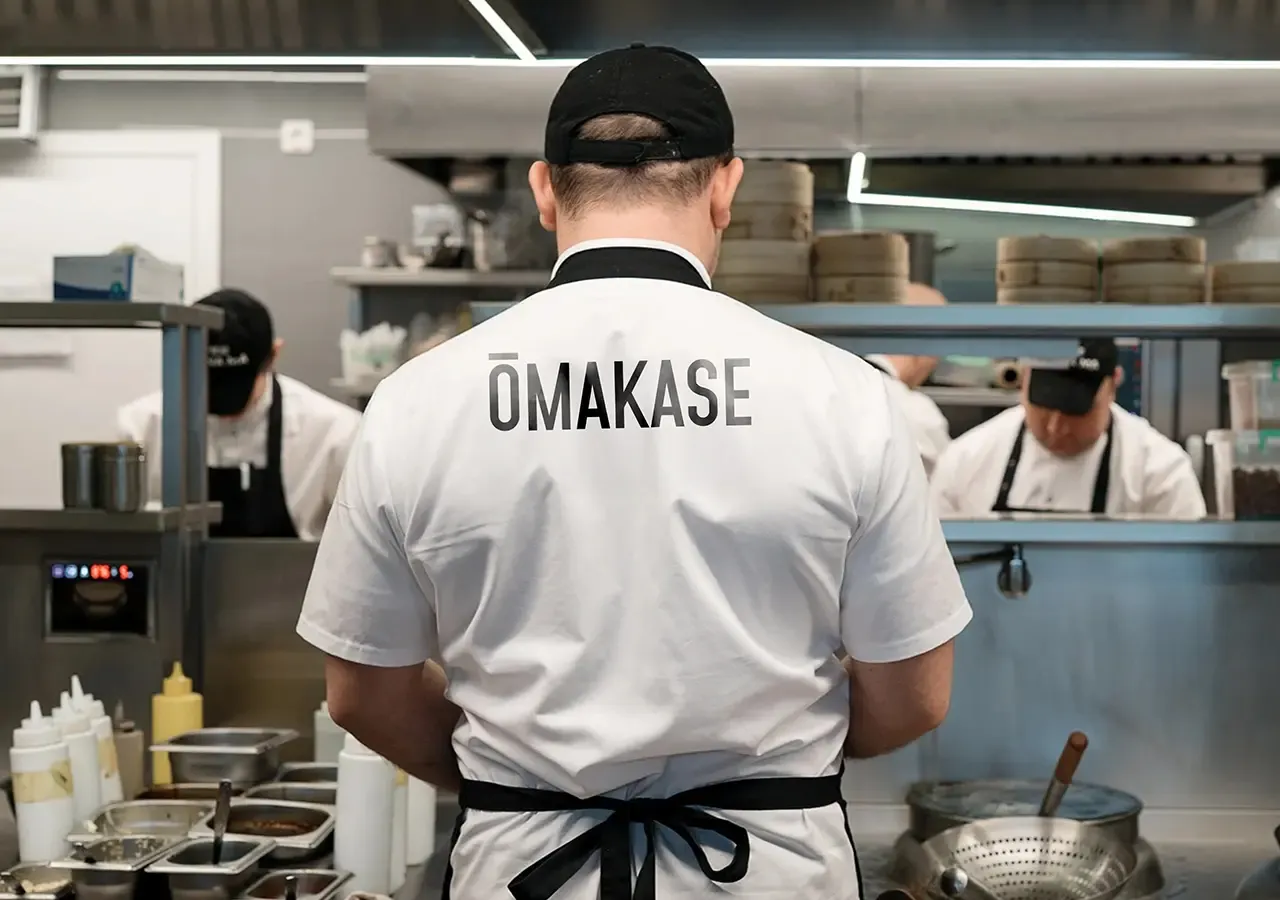
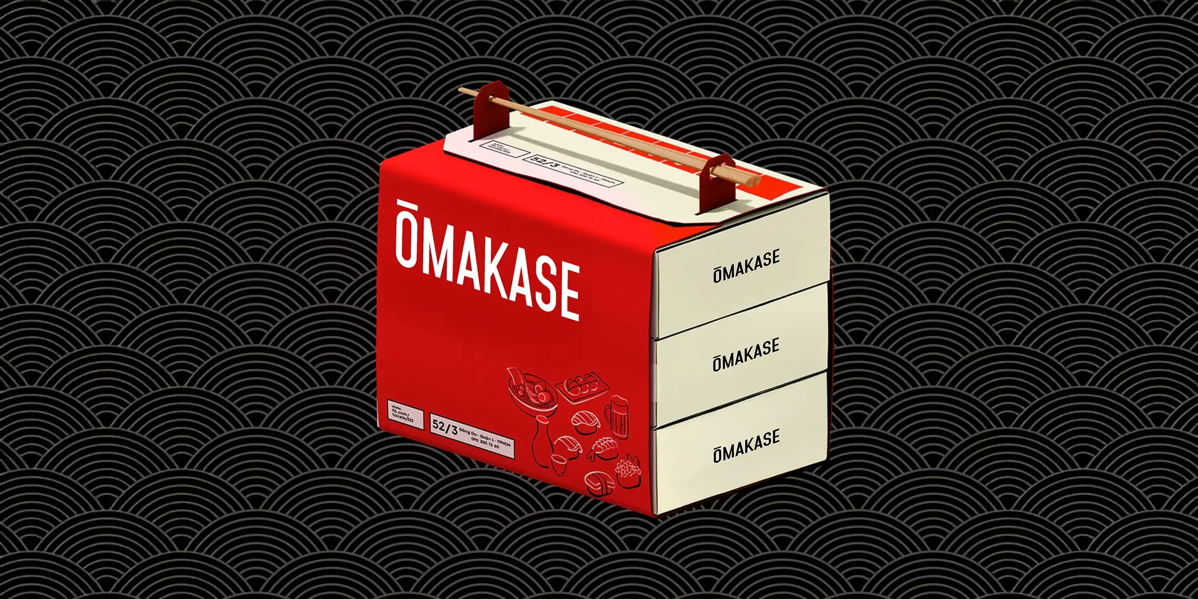
The responsive system works across menus, reservation communications, in-venue details, digital campaigns, event content and motion graphics.
Daytime applications can remain calm and highly controlled, while evening creative can introduce greater contrast, movement and intensity within a single connected identity.
The connected impact
More connection before every seating.
Ōmakase now has an identity capable of expressing both sides of its hospitality experience. Minimalist design and monochrome restraint capture purity and ritual, while ambient accents and rhythmic graphics introduce movement and anticipation.
The brand moves between tradition and modernity, stillness and energy, sushi and sound while remaining elevated, precise and confidently different.
Overall results
Measured across the connected programme rather than isolated channel activity.