The challenge
Turning late-night energy into a clearer brand.
Noche Loca needed to make an immediate impact in Hong Kong’s fast-moving dining and nightlife market. The identity had to communicate the food while making clear that the experience extended beyond the menu into restaurant, bar and late-night social destination.
The challenge was to create a brand that felt spontaneous and chaotic on the surface, yet stayed controlled and recognisable across busy streets, crowded social feeds and the physical venue.
Our approach
A digital experience made to create demand.
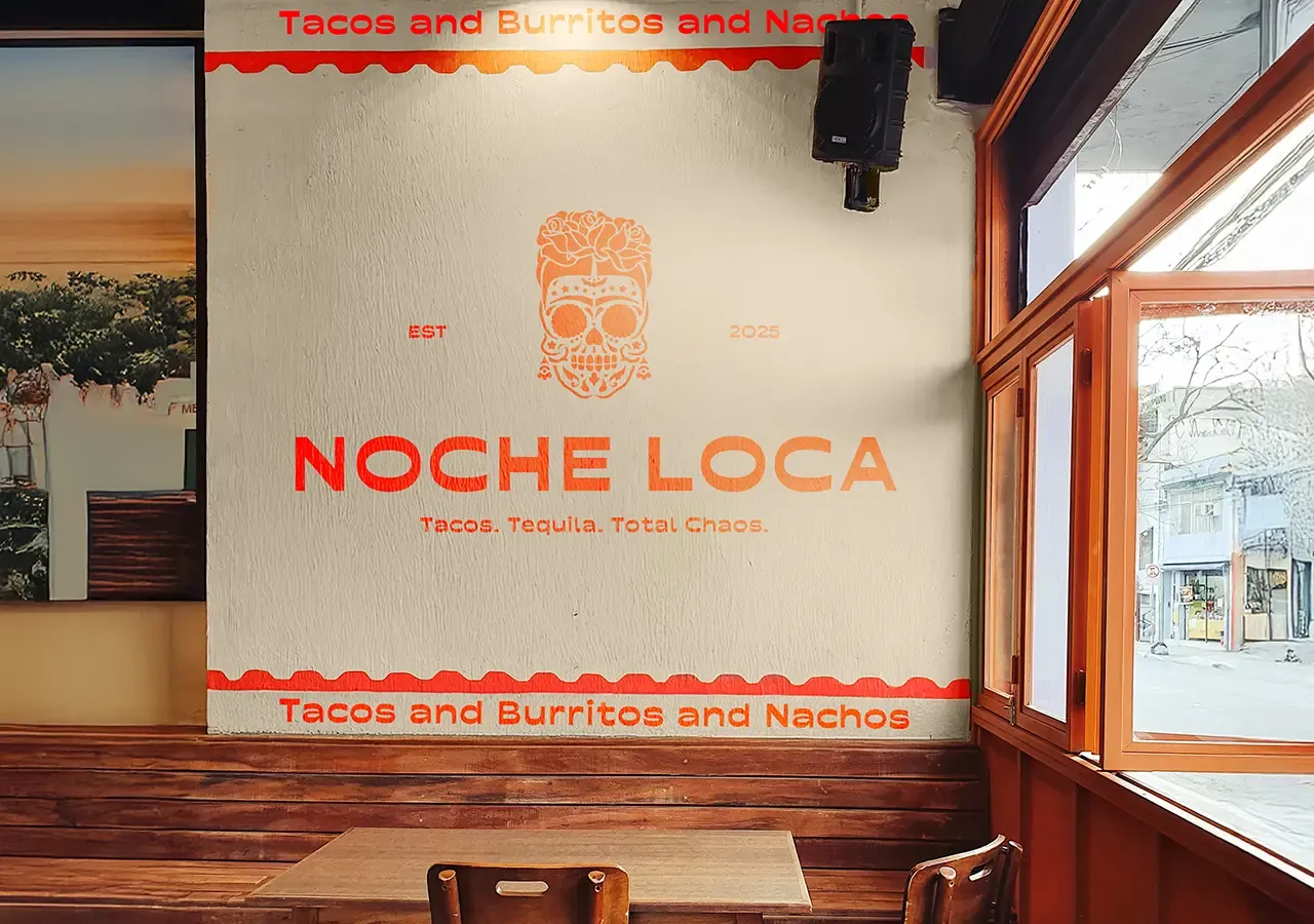
We built Noche Loca around a night that refuses to follow the plan. Movement, contrast and personality shaped a direction where logos can shift, colours collide and typography changes scale and direction.
Behind that energy sits a considered system of colours, typographic principles and brand assets that lets the concept move fast without losing its identity.
Brand Position
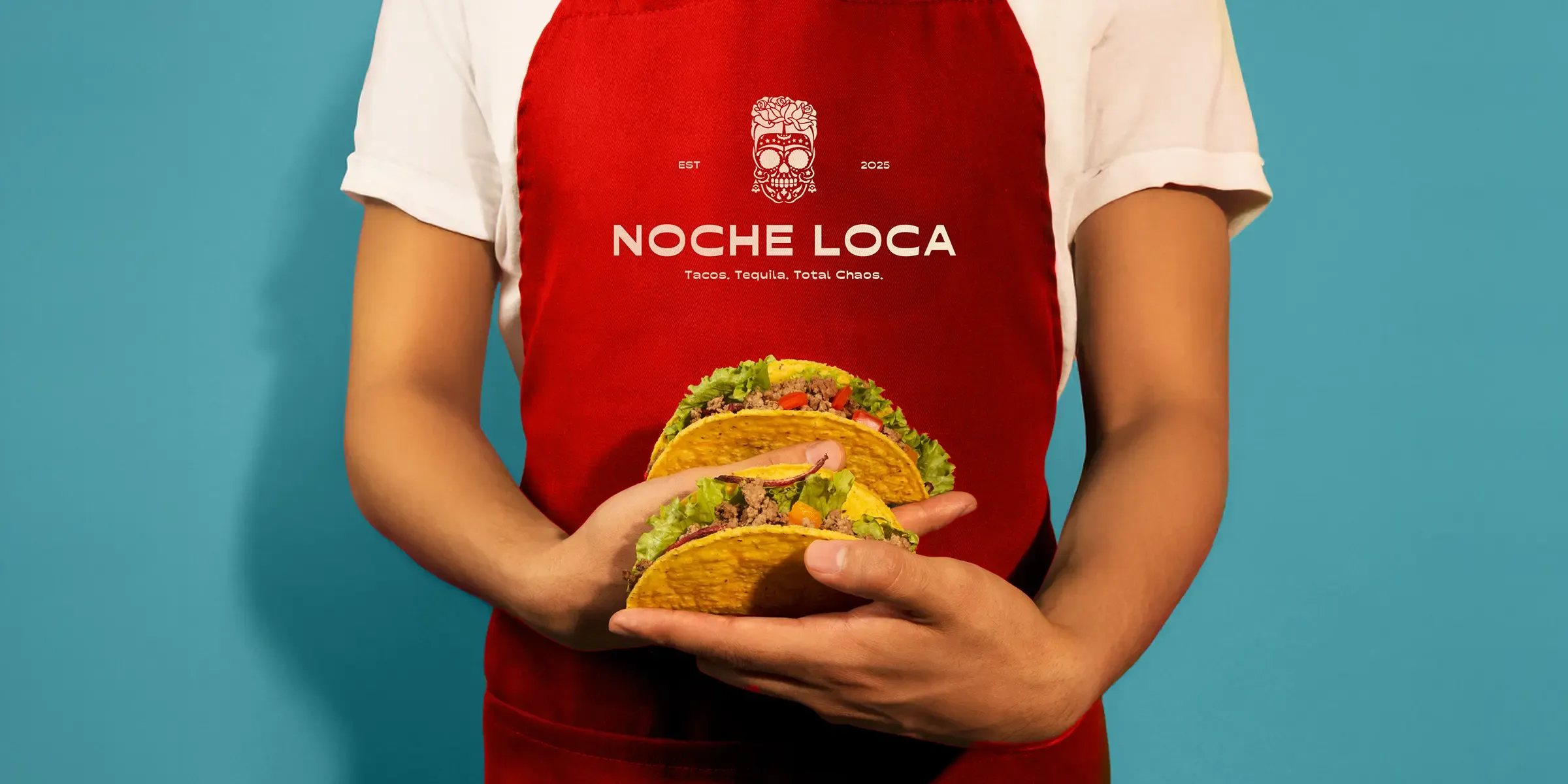
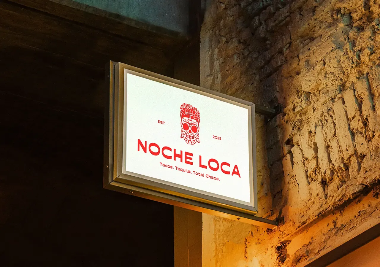
Tacos, tequila, total chaos.
Tacos represent food and the social ritual of sharing. Tequila introduces the bar, energy and spontaneity of the night. Total chaos gives the concept the attitude that separates it from a conventional restaurant.
Together, these three elements create a memorable proposition that sets clear expectations while leaving room for the experience to surprise people.
Visual Identity
Creating controlled chaos.
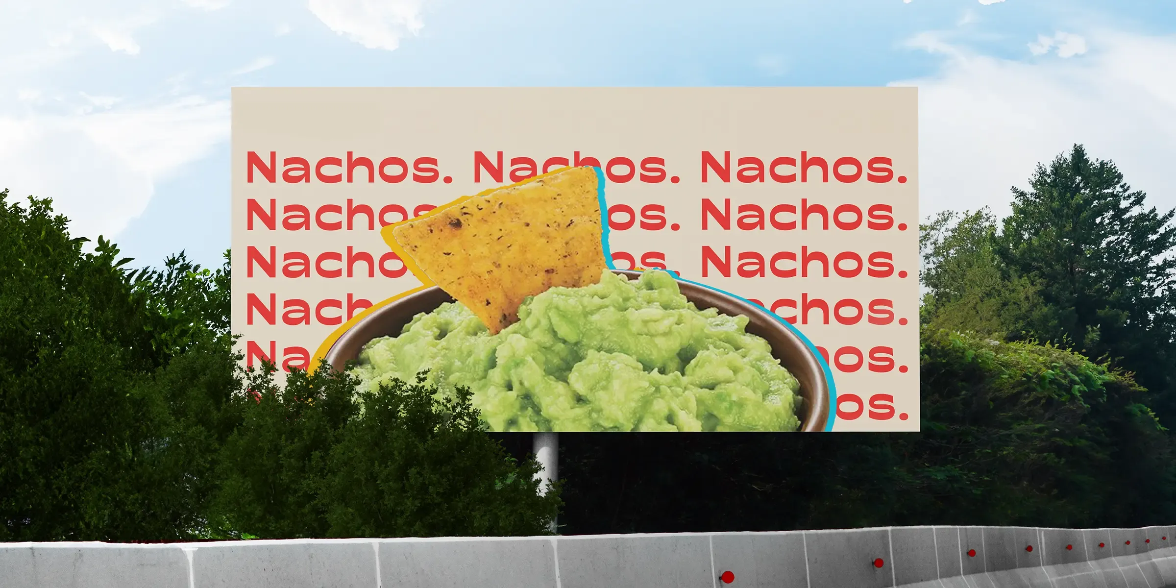
Layouts shift between applications, type can be oversized, rotated or layered, and graphic elements introduce energy and controlled visual disruption.
Fiery saturated tones, expressive logos and playful typography create immediate impact, while consistent visual principles keep every touchpoint recognisable.
Tone of Voice
Loud, playful and unfiltered.
Short statements, unexpected lines and direct invitations create a voice that feels closer to the friend persuading everyone to stay for another round than traditional hospitality branding.
Menus, signage and social captions become part of the experience, entertaining while still giving guests the clarity they need.
Brand Experience
Built for food, nightlife and social.
Menus, signage, uniforms, wall graphics, lighting and music bring colour, language and movement into one immersive venue experience.
The flexible system supports food-led communications in the day and increasing colour, movement and attitude in the evening, while remaining built for social content, campaigns and future locations.
The connected impact
More reasons to arrive, return and share.
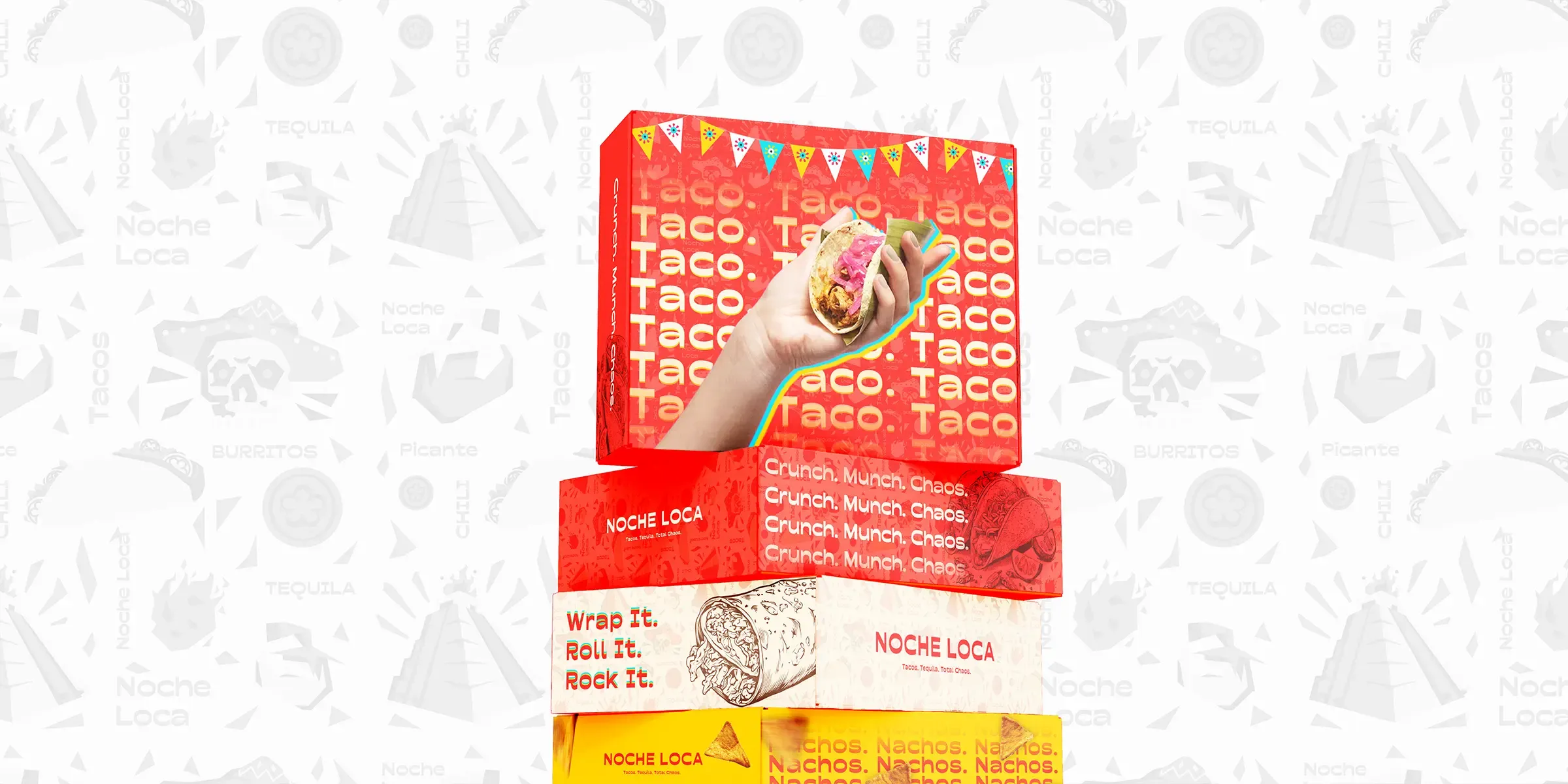
Noche Loca now has an identity capable of matching the energy of the venue. Expressive logos, fiery colours, playful type and an unfiltered voice create controlled chaos across physical and digital touchpoints.
The system brings food, drinks and late-night energy into one coherent experience designed to move fast, have fun and start the party before the first taco reaches the table.
Overall results
Measured across the connected programme rather than isolated channel activity.