The challenge
Making performance-led wellbeing easier to access.
CTRL was created for everyday high performers who want clarity, consistency and purpose from the products they use. In a supplement market crowded with complex product names, exaggerated promises and noisy packaging, the brand needed to communicate performance and scientific credibility while remaining clear and accessible.
The identity had to build trust, helping customers understand what each product is for, where it fits within their routine and why they might choose it. The challenge was to turn simplicity into a position of strength without following the aggressive visual conventions of traditional sports nutrition.
Our approach
A digital system that keeps members moving.
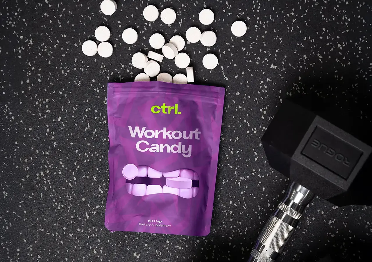
We built the identity around the idea that high performance begins with clarity. Every visual and verbal element has a defined purpose, presenting products with confidence and precision rather than unnecessary information.
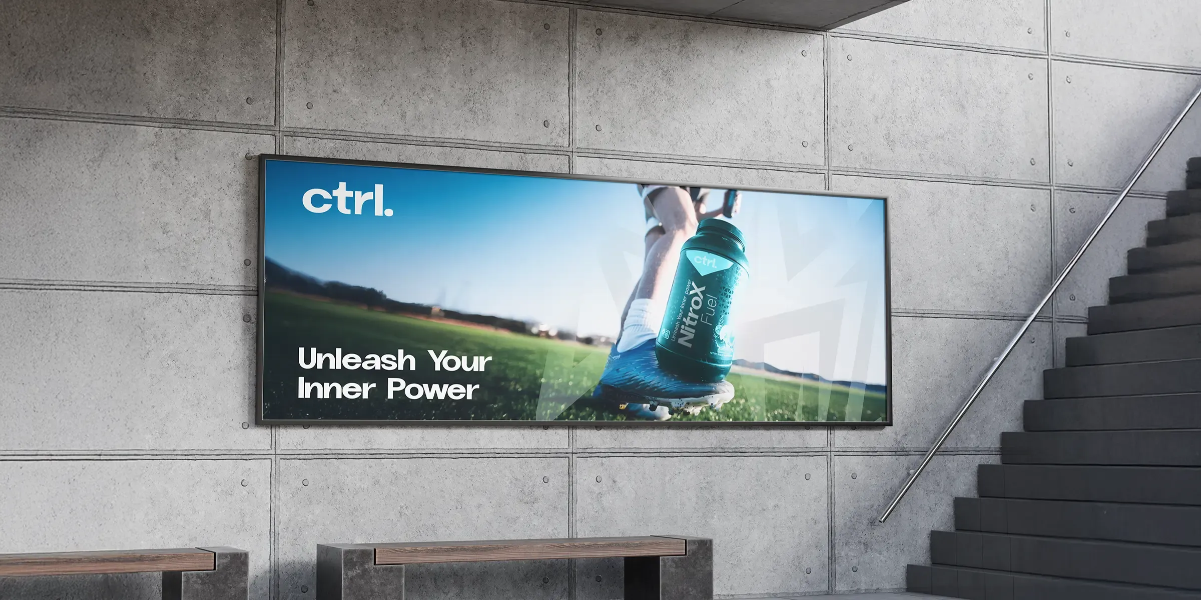
Clinical design discipline, modern performance culture, structured layouts, bold typography and a restrained palette work together to create a system that feels precise, credible and direct across products, packaging and digital applications.
Brand Position
A brand built for everyday high performers.
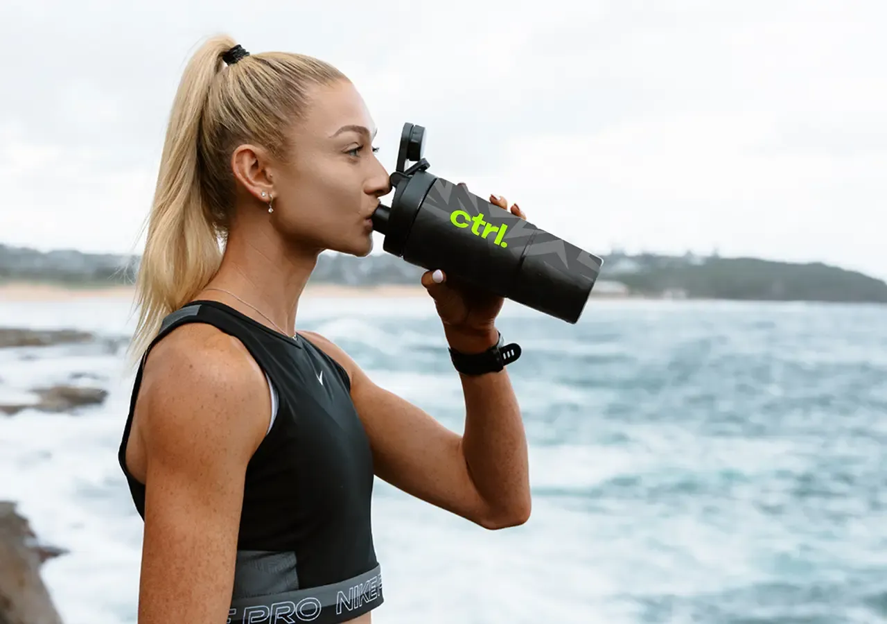
CTRL broadens performance beyond elite sport, speaking to professionals, founders, creatives, fitness enthusiasts and people looking to perform more consistently across demanding days.
The identity connects mental focus, physical capability and recovery, giving brain, body and recovery a simple, scalable place within one performance proposition.
Brand Idea
No hype. no fluff.
The direct attitude establishes what customers can expect from every interaction. Communication avoids exaggerated language, complicated explanations and unnecessary wellness jargon.
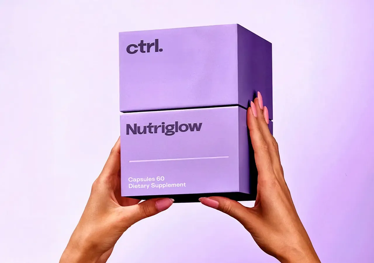
Clear product names, structured information and confident hierarchy make the range easier to understand, helping simplicity become a competitive advantage.
Visual Identity
Minimalism with purpose.
Clean compositions, controlled spacing and a limited number of visual elements create a precise, recognisable system that keeps product information at the centre.
Bold, structured letterforms create impact while clear supporting styles provide flexibility for packaging, product information and digital content.
Brand System
Built to scale across performance.
The stripped-back palette gives CTRL a clean clinical foundation, with controlled accents available to differentiate products and performance categories.
Shared layouts and typographic principles allow new supplements, formats and categories to be introduced while retaining recognition across packaging, e-commerce, social, advertising and education.
The connected impact
More connection across the customer journey.
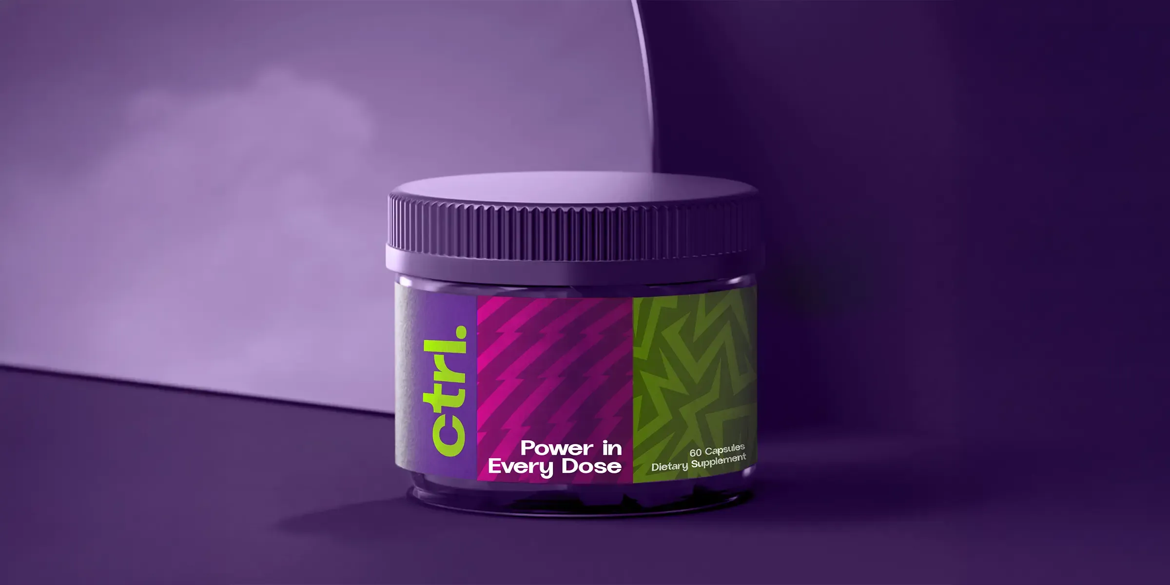
CTRL now has a bold, focused identity that reflects its approach to modern supplementation. Minimalist design removes noise, confident typography creates strength and a precise information system reinforces the clarity behind the products.
The resulting brand gives CTRL a platform to present products, educate audiences and expand across brain, body and recovery without relying on exaggerated claims or visual excess.
Overall results
Measured across the connected programme rather than isolated channel activity.