The challenge
Making wellness expertise easier to discover.
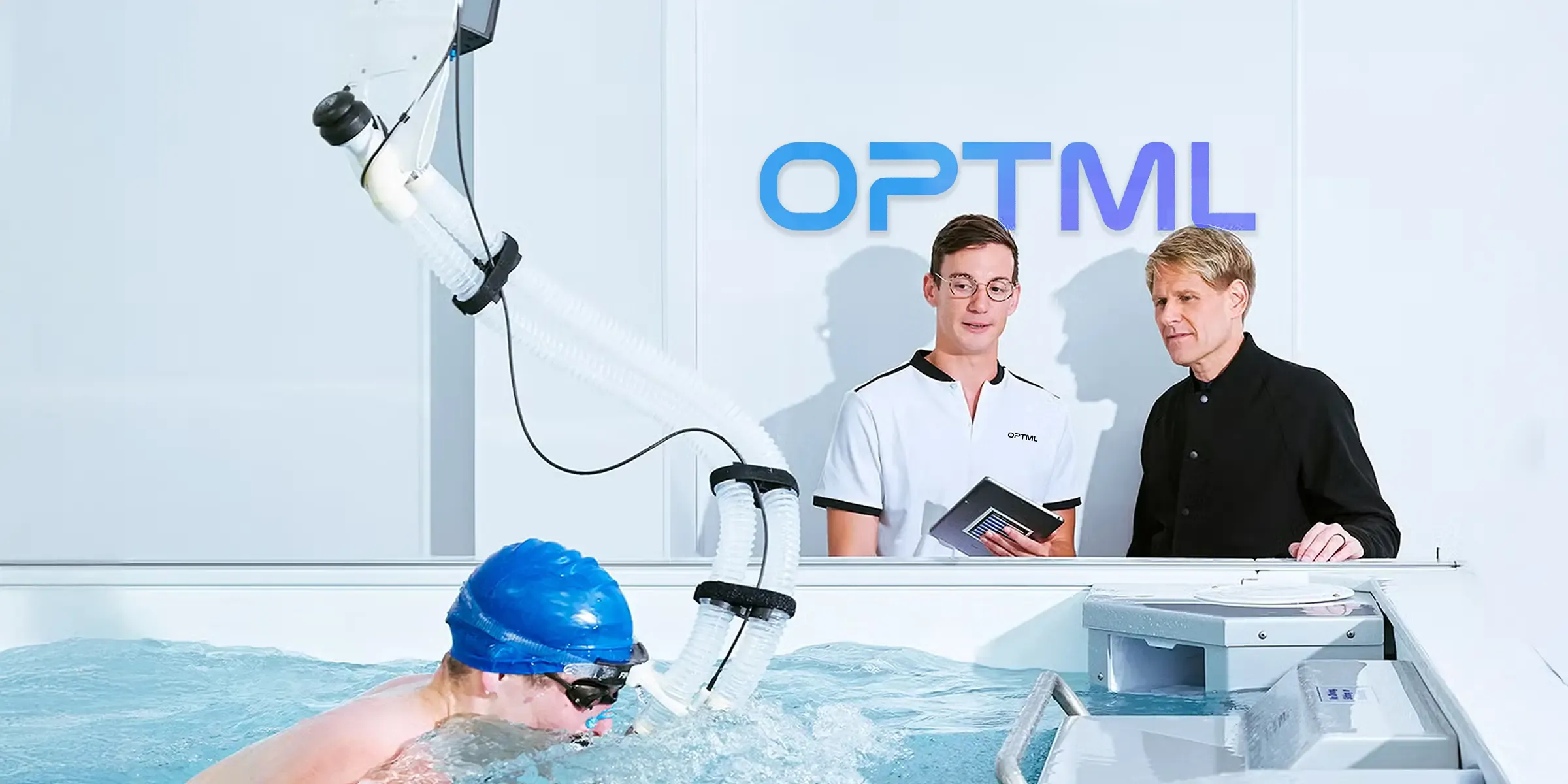
OPTML brings together IV drips, red light therapy, cold plunges and oxygen chambers for people looking to invest intentionally in how they feel, recover and perform. The identity had to represent innovation and expertise while making a complex category clear and accessible.
It needed to feel credible without becoming intimidatingly clinical, appealing to serious high performers while welcoming people exploring biohacking for the first time. The challenge was to position OPTML at the forefront of the category while bringing a wider audience with it.
Our approach
A digital journey built around patient confidence.
We developed the identity around one expandable idea: Optimise Everything. The concept frames performance as the connected relationship between physical health, mental clarity, energy, recovery and resilience.
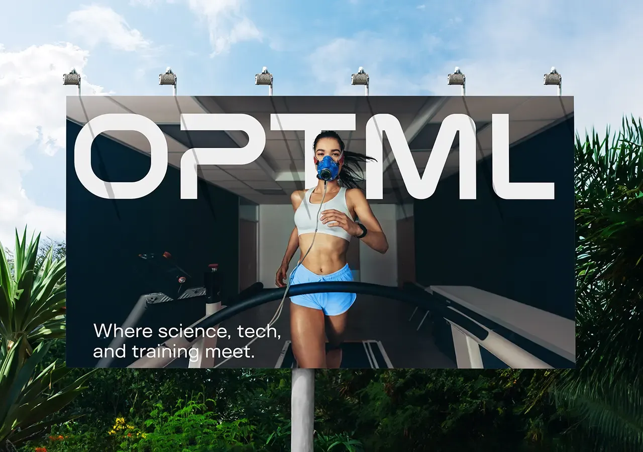
Clean structures communicate credibility, sharp typography provides energy and technology-inspired details give the brand a progressive visual language built around precision, progress and control.
Brand Philosophy
Optimise everything.
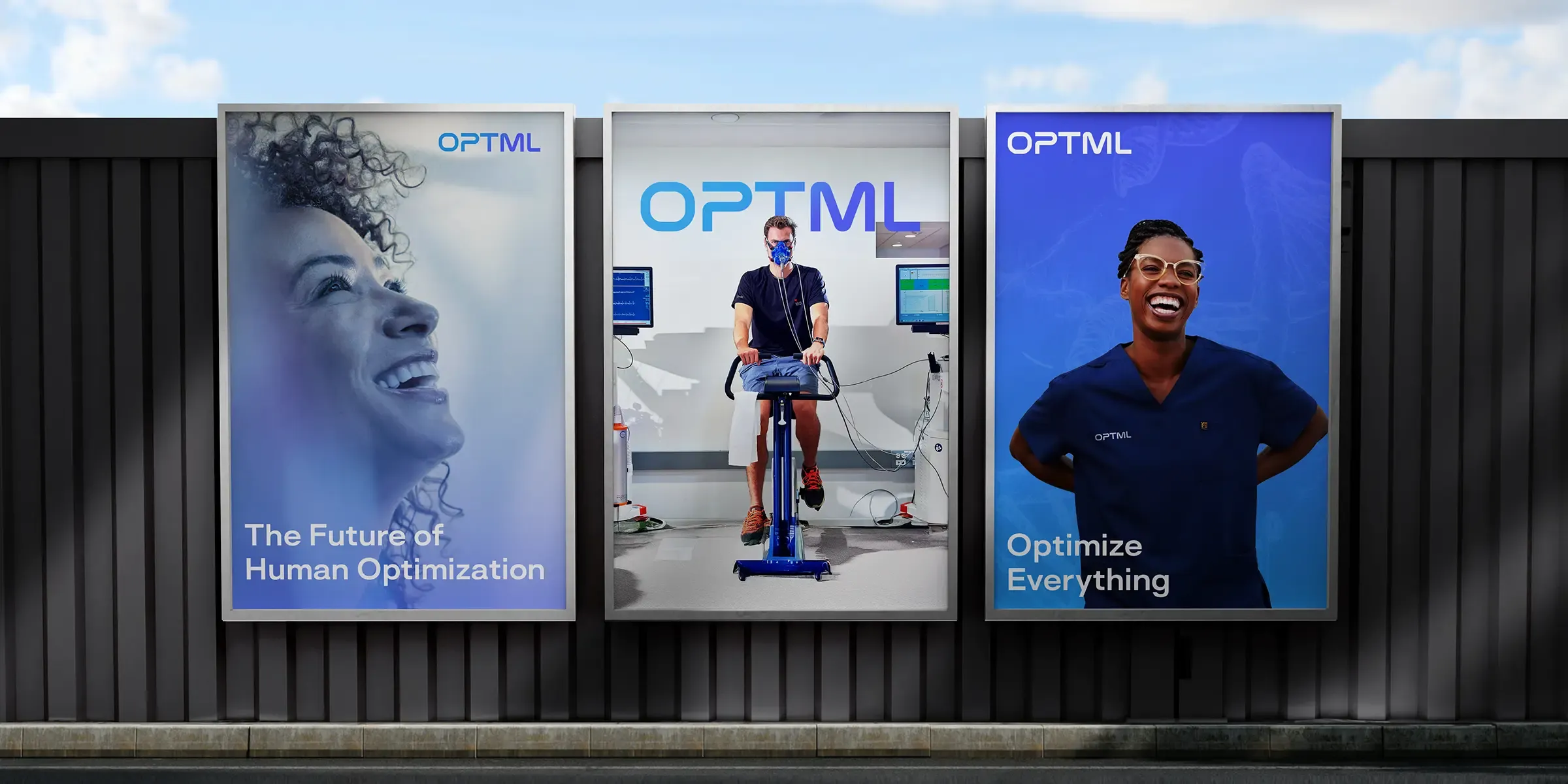
The defining idea lets OPTML speak about optimising energy, recovery, focus, resilience, sleep and performance while retaining one consistent central message.
Short, direct and ambitious, it positions the brand as a complete approach to becoming better rather than a collection of individual treatments.
Visual Identity
Clean, clinical and progressive.
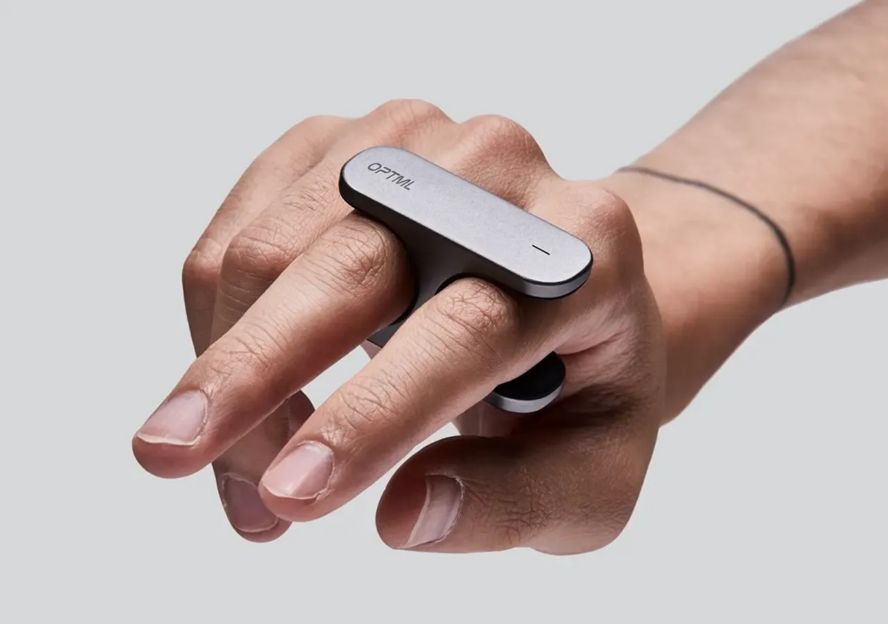
Structured layouts, generous spacing and clear hierarchy communicate order, precision and credibility without allowing the identity to become cold or institutional.
Sharp, technology-inspired typography, strong contrast and carefully selected accents create a futuristic atmosphere that stays clear, accessible and grounded in performance.
Customer Experience
Making complex services feel clear.
Clear categories, concise descriptions and structured information help customers understand unfamiliar treatments and where they may fit within a wider performance routine.
The system removes unnecessary complexity without oversimplifying the category, allowing OPTML to feel both advanced and approachable.
Brand System
Built for progress.
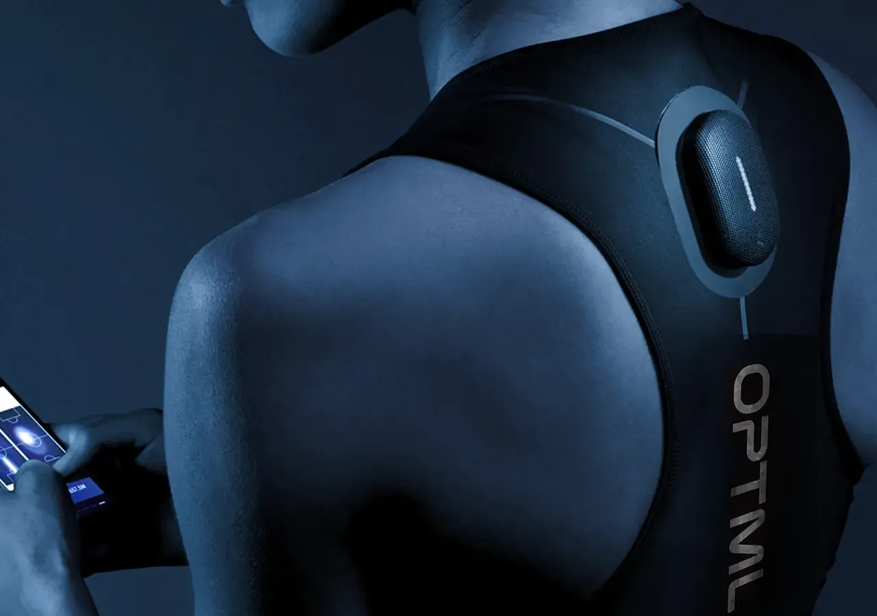
Lines, grids and structured graphic elements make measurement, data and continuous improvement visible across treatment spaces, digital platforms and educational content.
The flexible identity can support new services, technologies, programmes and locations while maintaining a consistent connection to the original Optimise Everything philosophy.
The connected impact
More demand for meaningful outcomes.
OPTML now has an identity that reflects its position at the forefront of biohacking and personal performance. Clean layouts create clarity, sharp typography creates confidence and technology-inspired graphics communicate innovation and momentum.
The brand provides a platform for explaining unfamiliar services, connecting with high performers and introducing biohacking to a wider audience without compromising its sense of expertise.
Overall results
Measured across the connected programme rather than isolated channel activity.