The challenge
Making expert aesthetics more approachable.
Neura needed to communicate intelligence without making technology itself the focus. Its identity had to connect B2B automation and consumer wellness without becoming too corporate for consumers or too lifestyle-led for business audiences.
The brand also needed to make advanced technology feel supportive rather than intimidating in a category often defined by technical language and futuristic imagery.
Our approach
A connected journey from discovery to consultation.
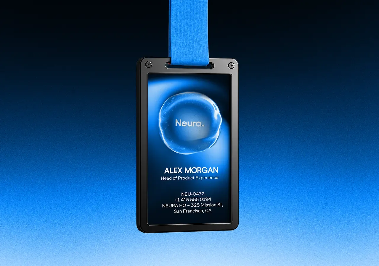
We built the identity around the role technology should play in people's lives: working quietly behind the experience, reducing friction and helping people make better decisions without demanding attention.
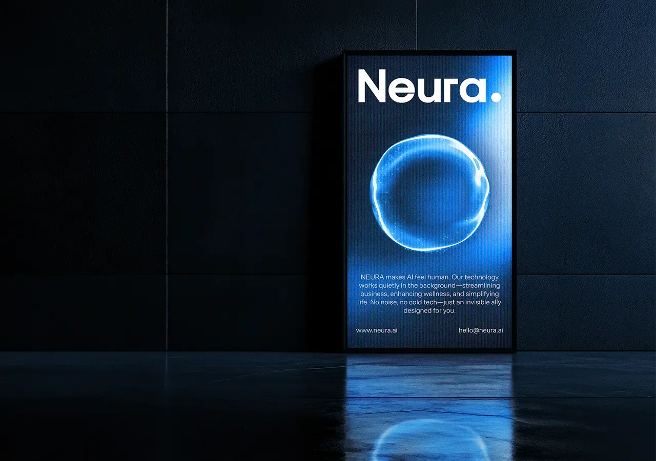
Soft gradients, fluid motion and minimalist typography balance calm human understanding with precise structure.
Brand Position
Intelligence without intimidation.
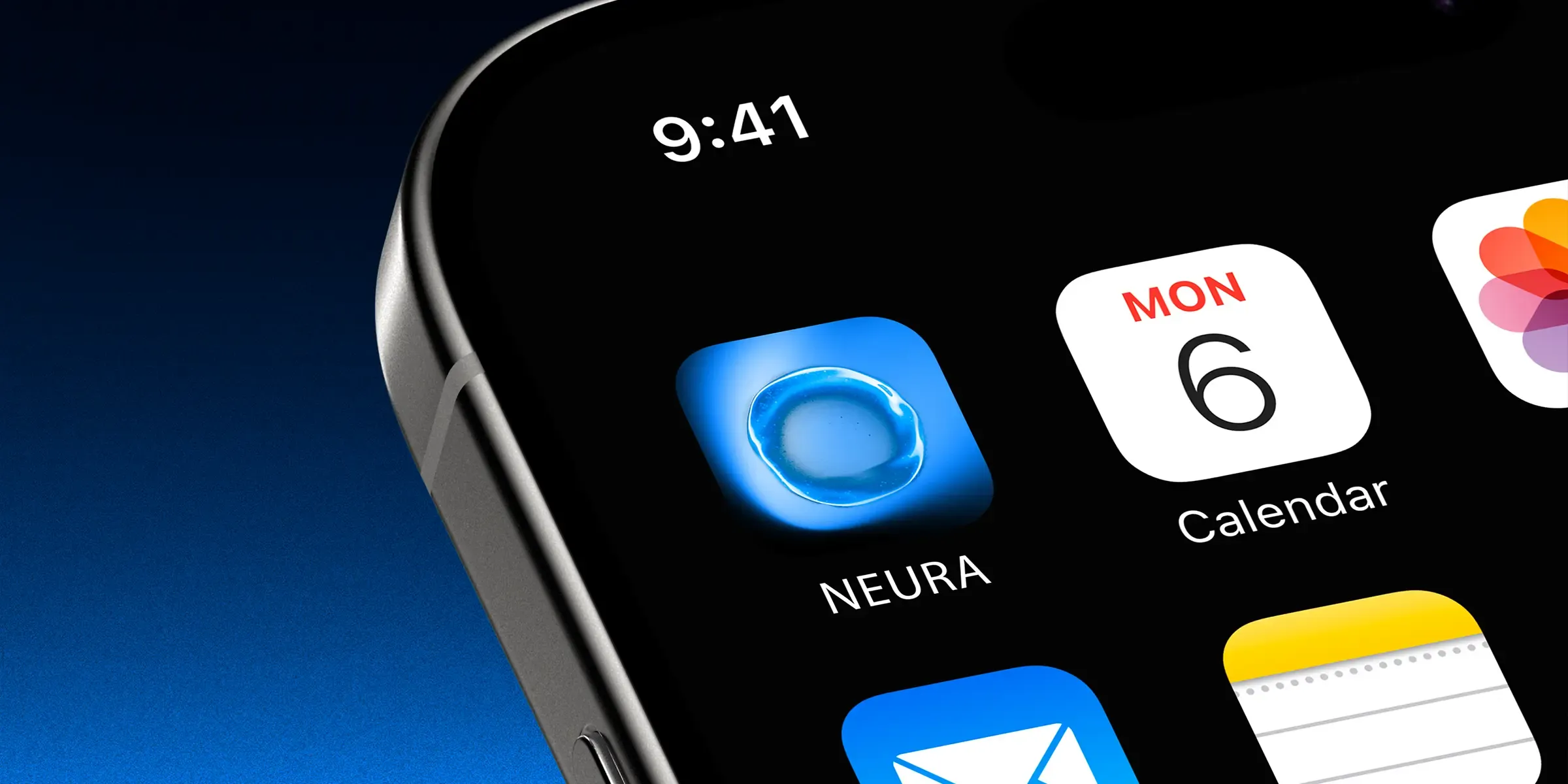
The identity presents intelligence through clarity. Information is carefully structured, language is direct and visual elements move with purpose.
Neura feels advanced because each component works together seamlessly, not because it relies on familiar symbols of futuristic technology.
Brand Principles
Invisible, intuitive and integrated.
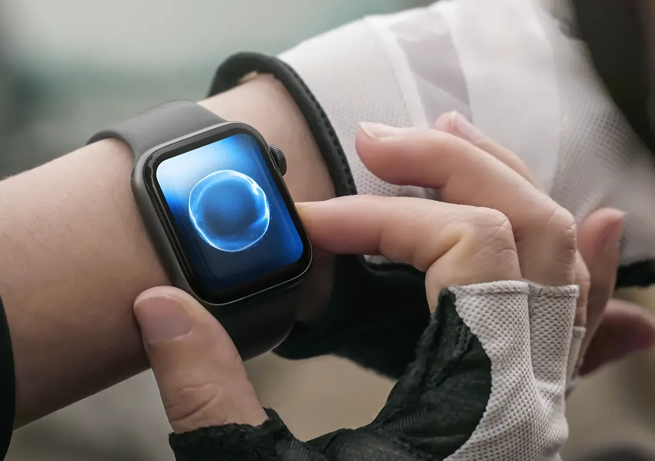
Invisible means the technology reduces friction without demanding attention. Intuitive means people can access advanced capabilities without technical expertise. Integrated means Neura becomes part of existing operations, decisions and daily routines.
Together, the principles provide a framework for future products, services and communications.
Visual Identity
A fluid visual language.
Fluid forms reflect adaptation, learning and the movement of information without relying on literal diagrams. Soft gradients introduce warmth and depth, while precise layouts keep the identity credible across different contexts.
The system can become more expressive for consumer communications and more controlled for business applications.
Brand Ecosystem
Designed for evolving products.
The system supports corporate communications, product identities, digital platforms, automation dashboards, consumer wellness tools and investor materials without fragmenting the brand.
Each application can adjust its balance of structure, colour and movement while retaining the principles that connect it to Neura.
The connected impact
Better experiences for every patient.
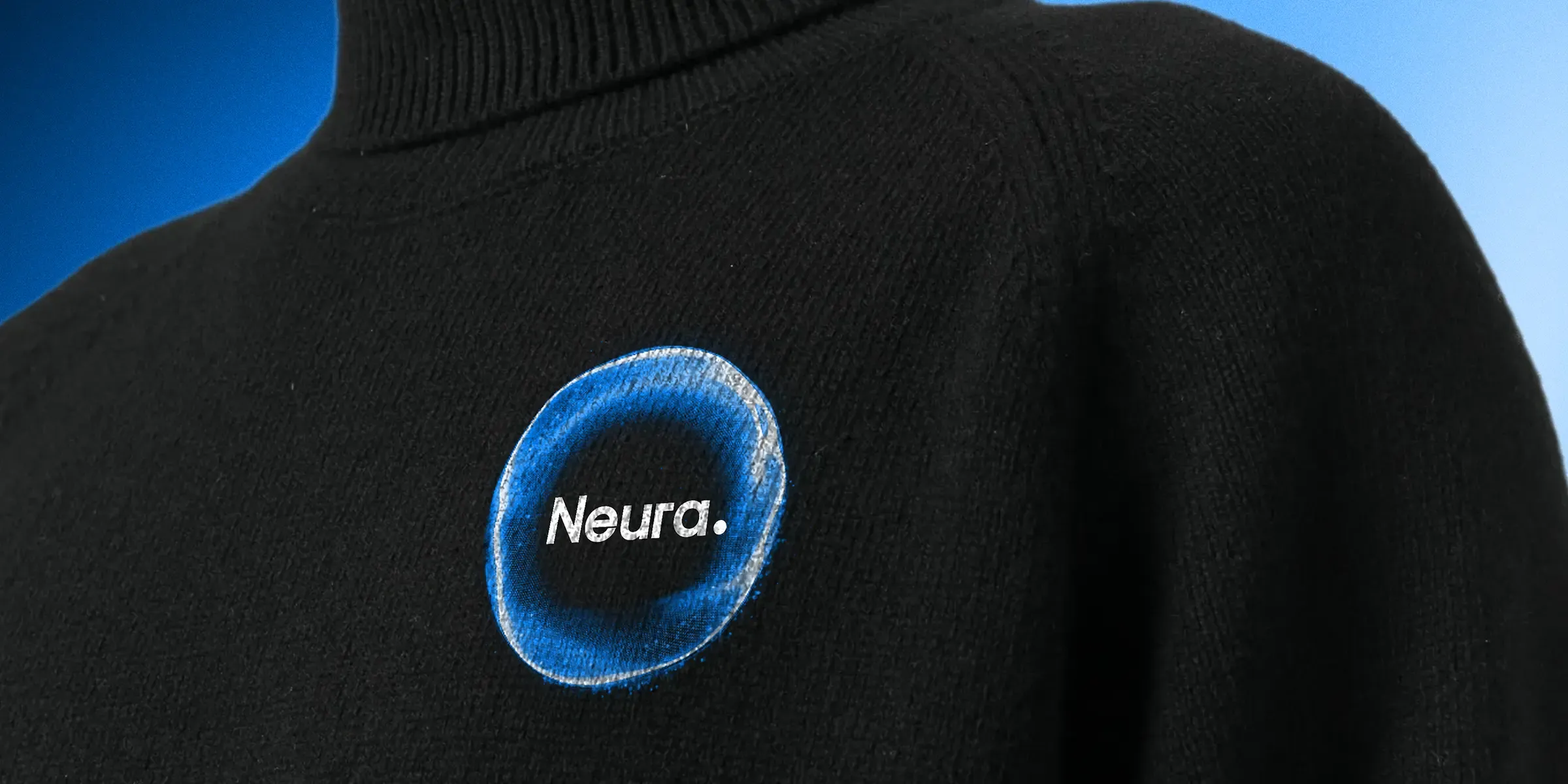
The identity positions artificial intelligence as a seamless extension of life, improving operations, supporting decisions and making everyday experiences more intuitive.
It gives Neura room to develop new services and products without losing the human-centred principles that define the wider brand.
Overall results
Measured across the connected programme rather than isolated channel activity.